August 28, 2013

Annie Sloan Chalk Paint - Florence Hutch

I bought a new to me Chalk Paint colour recently - Florence. I was so excited to paint something with it, and I thought this hutch would be perfect!
I didn't want to use the Florence in full strength so I mixed it 1:1 with Old White.
This mix makes a gorgeous fresh colour, but it is still pretty bright!  I wanted a soft, worn, layered look for this piece so after two coats of the 1:1 mix, I further lightened the mix by adding more Old White - can't tell you quantities sorry, I just piled some in till I liked the look of it!

I did one coat of the lighter colour, then made a whitewash of Old White and applied that to all of the blue/green bits, wiping it off with a dry clean cloth.

I painted the backing board and cupboard fronts in Old White, over the top of the Florence/Old White mix.

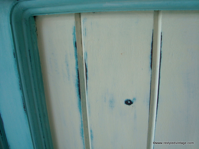
Once all the paint was dry I hit it with my mouse sander and 240 grit sandpaper, wearing the top layer of paint off in places to reveal the slightly deeper colour underneath.  

After a wax and a buff, here it is...
To me the hutch looks quite blue in some shots - I'm not quite sure how to describe it - it's neither blue nor green, but it is very pretty :)


This photo shows the layers of colour, showing up the grain lines in the timber.


Cathy at La 'Bella Petite had a buyer for this as soon as it was finished, so I'm off down the highway tomorrow to deliver it!
Linking up with:


August 19, 2013

Distressed Vintage Green Desk

As you know, I am always painting furniture, it is what I do.  What I don't do, nearly often enough, is paint furniture for my own home...sure, I have lots of pieces I'd like to paint, but they keep slipping down the list as I am kept busy painting pieces to sell, and painting pieces for others.

Not that I'm complaining, I am thankful and grateful that I get to do what I love as a job!

I have a mental list of things that I am on the lookout for for my own home, and one of these things was a desk with a hutch for my little boy.  A few weeks back, I walked into one of my local haunts, and this was waiting for me...
Granted, it is a little on the large side, but it was solid timber, had lovely t&g backing on the hutch, and was a great price. It had to come home with me!

My son has great taste, like his Mum ;)  When I did this bookcase, he fell in love with the colour, and requested the same for his desk.

I mixed up my favourite blend of Annie Sloan Chalk Paint® in Duck Egg and Antibes Green and painted on two coats, before distressing and waxing with Annie Sloan Clear Wax.

Here it is...
I styled the desk up how I would like it to look, but it will look very different when my 6 year old boy has had his way with it ;)  I have promised to share photos once it is in his room. 
He is sitting beside me right now and just saw the photos of 'his' desk and said 'oh why have you got all that pretty stuff on my desk?' haha!

Once the desk is in his room I am going to make a custom fitted notice board to fit in the gap between the desk top and bottom of the hutch.


The chair belongs at my desk, and is a keeper. I had it done a few years ago and absolutely love it.


Obviously the shelf at the bottom for the computer tower is no longer required in this day and age lol...still working out what to do with that.  I will probably install a shelf in there and try and find some baskets to fit.  If you have any other ideas, I am all ears!
Here it is in my showroom this morning with the bookcase of the same colour...this sold some time ago and it is being picked up this week.

Think it might be time to paint something a different colour now...although I do have a custom job to start on in guess what, the same colour :)  

Just as well I love it!

August 15, 2013

Pretty Pastel Bookcase

Hello! Today I'm showing you a bookcase transformation that I completed a few days ago.  
You may have already seen the photos on my Facebook page.
This bookcase belongs to Hayley, whose dining suite I refurbished a little while ago.
She absolutely loved her new Beachy Dining Suite and decided she'd like something done with her bookcase to match the new lighter fresh look. Hayley had seen some of my other projects using pastels, particularly these chairs and this dining suite.
In fact before I did her dining suite we discussed doing the chairs in pastel shades but in the end decided to bring colour into her dining area in other ways, keeping the chairs more versatile in distressed white.

The bookcase was just the place to introduce a bit of colour. We talked about which pastel shades Hayley liked, which included all four colours used in the first chair photo above, along with mauve as we needed one more colour to make our plan work.  After brainstorming a few options, we decided that the main body of the bookcase would be Annie Sloan's Old White, to tie in with the dining suite, and the shelves would each be a different pastel shade.  I was so excited - I LOVE projects like this where the client isn't scared to try something a bit outside the box!

Here's how it turned out...
As you can see I did each shelf a different pastel shade - from top to bottom we have Taubmans Sunwashed Straw, Porters Cupcake, Pale Blue (misstint), Taubmans Old Lavender, Porters Glossodia.  Top and bottom mouldings are Porters Cupcake.
Love this cute little detail on the front edges, especially now it is picked out in pink!


To finish, here's a side-by-side look at Hayley's bookcase and dining suite prior to and after the Restyled Vintage treatment.
Much better, I reckon!
Thanks to Hayley for entrusting your furniture to me once again, I had lots of fun bringing your vision to life :)

August 3, 2013

More Porters Liquid Zinc Projects

Two posts in one night - I know!  Last week when I showed you the Coffee Table I did for my client Amanda in Porters Liquid Zinc, I mentioned that I had done a couple of 'practice' pieces so I knew how the paint finish would turn out.

These were my victims:
A wine table I believe with a green leather top on it, and a pine bedside cabinet in that golden honey colour we all love (insert Tui ad here)...that means 'yeah right' for the non-Kiwis ;)

Anyway...I cleaned then primed these pieces, using Annie Sloan Chalk Paint® in Paris Grey as my primer. I could have used ordinary adhesion primer but I wanted to check the Chalk Paint® worked as a primer when you put another paint (non Chalk Paint®) over the top of it.  It does :)

Oh, I nearly forgot...the first thing I did was whack some nails in on the corners, to mimic rivets on a real metal piece.


After priming, I painted on the Liquid Zinc mixture, doing two coats (allowing drying time in between of course). Once that was dry I painted on the Ageing Solution and waited for the magic to happen.
Here's how they turned out...


I've learnt that the finish you get with this paint system is quite random and will differ for each project - where it bubbles, leaves holes, gets a brownish tinge, goes darker (almost purple) - all random.  The direction and pattern of your brush strokes in the base coat definitely has an effect - you can see them quite clearly in this photo above. Keeping the brush strokes all over the place adds to the effect I think.


These pieces are available for sale, please contact karen@restyledvintage.com for details.
Linking up with: